|
|
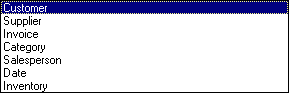
The Ranking Sales Reports are a series of reports that will rank your best sales to your worst sales based on Quantity, Total or Profit. The reports are produced based on Invoices, Customers, Salesperson, Suppliers, Inventory, Category and Dates.
Recalc: Calculates the data based on invoices between two dates.
Report: Reports the data based on the above calculation.
Graph: Graphs the report.
Print: Prints the report or graph.
There are two stages to the Ranking Sales Report.
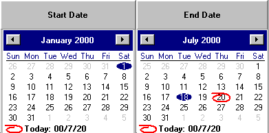
Calculation is the analyzing or calculating of the invoices between two date ranges. This operation requires a start date and an end date and whether you want labor included. The ranking sales report will then analyze the sales between the two dates. This operation usually requires a long time. Once the calculation is complete, you may run any of the reports. You do not need to perform the calculation each time, just when you want to consider a new date range or include new invoices in this date range.
 Check whether you wish to include labor amounts in the calculation.
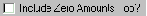 This option will pre-load all the inventory, customers, suppliers and categories with zero amounts. This takes much longer but allows items that have had no sales to show up on the report.
Report is to run one of the available reports based on the data collected in step one.
Select the report you wish to run, and then press the Report button. 

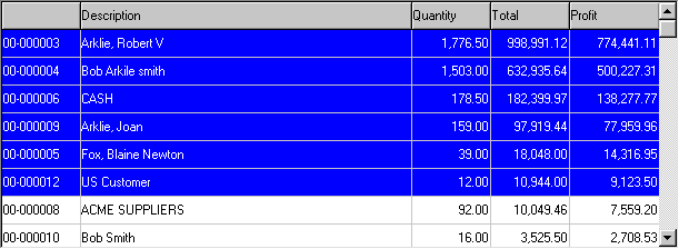
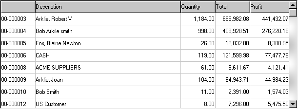
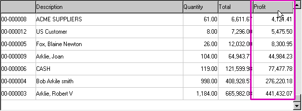
The report below shows customers ranked by their account number.
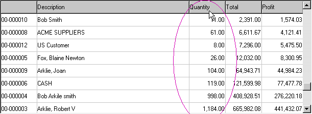
By clicking on the Quantity column header, you can sort the report by the quantity of sales.
You can also sort by Profit. This report shows that Robert Arklie is indeed our best customer and we should do our best to make him happy.
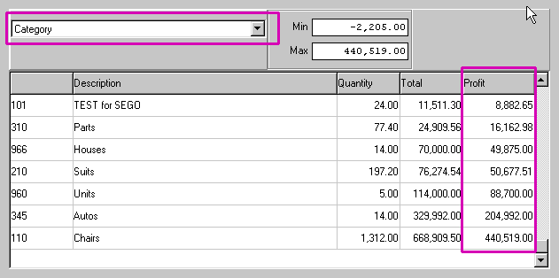
The Category Report ranked by Profit shows that you make most of your profit from chairs.
 Check or uncheck this button to reverse the ranking order of the report. You can also get this result from clicking on the column header a second time.
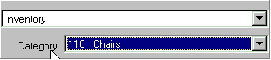 When selecting Inventory, you may narrow down the report to a given sub category.
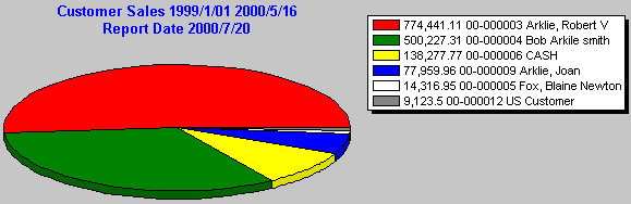
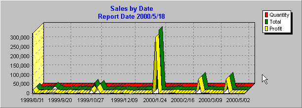
 The Graph button allows you to graph the sales based on the information obtained in the report.
This is an example of Sales by Date.
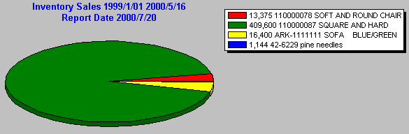
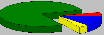
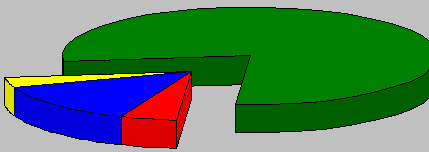
This is an example of a pie chart of Inventory, Sub category chairs.
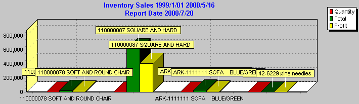
This is an example of a bar chart of Inventory, Sub category chairs.
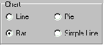
Select the chart type you wish to use and then press the Chart button.
This allows you to change the angle of the chart.
 This button allows you to zoom in and out of the report. You can move the report, up, down, left and right by pressing the right mouse button on the section of report you wish to view.
 These check boxes allow you to select which columns you wish to graph. This is really important for the pie graph as viewing all three pie graphs on top of each other does not look good.
 This check box toggles the values on or off.
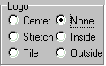 This tool allows you to put your logo (from the main window) on the graph.
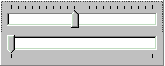
The first slider bar allows you to explode the largest piece of the pie.
The second slider bar allows you to rotate the chart.
You can graph a portion of the report by selecting a set of consecutive rows and then pressing the Graph button.